
When I started my website from scratch in 2020, I always intended to create a new logo as one of the first things I would work on. However, other tasks took priority, and now more than three years later, I still only have my name typed out in a font at the top of the site serving as a makeshift logo. This has made it difficult to make big design decisions elsewhere on the site, as I was afraid I would put a lot of work into a design element, only to have it clash with whatever I eventually settled on for a logo. This time around, I made sure to do things in a different order when starting over.
To check out the finished logo, feel free to jump straight to the end.
What is Blackletter

“Blackletter,” according to Wikipedia, “is a script used throughout Western Europe from approximately 1150 until the 17th century.” Despite its wide usage during the European Middle Ages, the style eventually fell out of favor due to the rising popularity of less ornate and more readable styles, in addition to having a complicated relationship to one of the 20th century’s worst events.
The style of this lettering is characterized by tall and narrow letters formed by straight, angular lines that often end in sharp final shapes that “bite,” or overlap, other letters. Due to its prominent historical usage in the European Middle Ages it still lives on as a sort of shorthand for the “medieval period” for works set in the time period, especially the fantasy fiction genre.
Inspiration
I began the project by researching everything I personally associated with this style of font. Surprising to me, many of the things I thought of as using “blackletter” actually use a different type of lettering like antiqua, a rotunda or minuscule style, or even a more generic Roman style font. I found this interesting because I guess I wasn’t aiming to reference any specific historic period precisely, rather I wanted to capture the general “vibe” these projects had.
Rough Sketch
I actually had this initial idea a while back and jumped directly into Adobe Illustrator to rough it out. According to the file created time, I started experimenting with this logo in April 2021.
I took a lot of inspiration from the Textura form because I thought its inherent geometry fit the best with my personal design style. I also really wanted to avoid the WWII connotations I mentioned above so I did my best to stay away from directly referencing the Fraktur style. The logo is made up only of straight lines, with each letter constructed using a combination of a square diamond shape and a vertical rectangle.
Refining
I lost interest in this logo for a while, but then something happened earlier last year that really got me back into the “medieval fantasy aesthetic” mindset.
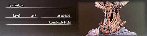
After months of adventuring around The Lands Between, battling all sorts of knights, wizards, and monsters, I felt compelled to find a way to make this logo work.
Letter Stems
One of the first changes I made was to slim down all of the vertical letter stems. In the original sketch each stem had the same width as one of the diamonds rotated 45°, but for the updated version I reduced the width to only half of the width of one of the serif finals. This added some visual contrast to the logo and made it more realistic in terms of what a calligraphy pen could produce.
X-Height
From the start, I had envisioned a version of the logo that could work as a monogram with only my initials. While working on the lockup, I realized that it would work best if it fit inside a square so it could be used for various favicon images that my site would eventually need.
This ultimately ended up deciding the final height of the letters so that the ascender and descender of the “f” would line up with the imagined outline, as would the bottom bottom terminal of the “r”. To fit into the square the overall x-height and body height of the letters was reduced a decent amount from the original sketch.
With the x-height, body height, stem width, and terminal size were established, I reworked the rest of the letters for consistency with the updated “r” and “f.”
Grid Layout
I had two main goals while creating each individual letter form: to use the minimum number of shapes necessary, and to strictly adhered to a 6x6 grid system created from the size of the base diamond shape.
I also decided to combine the “f” and “i” characters into an “fi” ligature was both for consistency in the letter spacing of my last name and also just because I am a fan of ligatured letters in general.
When I was in design school I remember a professor telling me -
Once An Accident, Twice A Coincidence, Three Times A Pattern
I looked this quote up and expected it to have been said by a famous designer, but apparently this is actually an Ian Flemming quote from the James Bond novel Goldfinger. Regardless of who coined the phrase, I made sure to repeat the small, diagonal spacing at least three times — once between the “r” and “y”, once in the “fi” ligature, and once in the open counter of the “e”.
With that spacing nailed down I designed the remaining letters to create as much diagonal alignment among their ascenders, descenders, and terminals as possible. Because of the previous constraints around x-height and overall letter height not every element could align perfectly.
The Finished Logo
Overall, I am very happy with how to the logo turned out. I think it is greatly improved from the sketch I started over a year ago. It feels like a progression in a line of geometric self branding I’ve been developing over the years, and I think it will be a good place to start developing the rest of the visual identity for my site redesign.
One accidental nicety from the design adhering to a strict grid is that the final logo comes out with a perfect 24:7 aspect ratio and full size and a 21:28 aspect ratio in the abbreviated form, which makes scaling the logo easier without getting into sub-pixel sizes.
Bonus - CSS Container Queries
What are Container Queries?
Container queries are a highly anticipated CSS feature that finally landed in all major browsers early in 2023. Unlike @media queries, which respond to the viewport size, container queries allow components to react to the size of their ancestor container rather than the overall page.
Swapping out a logo for an abbreviated version on small screen sizes is a very common design pattern, and with the two versions of my new logo it seemed like a natural place to try out this new feature.
The Code
Container queries rely on the CSS principle of “containment,” which requires the element to be styled to be wrapped in another element which has a container-type property set. For the inline SVG logo the wrapping element should semantically be a <figure> tag.
<figure>
  <svg preserveAspectRatio="xMinYMin slice" ...>
    <path class="r" id="r" ... />
    <path class="y" ... />
    <path class="a" ... />
    <path class="n" ... />
    <path class="f" id="f" ... />
    <path class="i" ... />
    <path class="l" ... />
    <path class="l" ... />
    <path class="e" ... />
    <path class="r" ... />
  </svg>
</figure>
One other thing to note is the preserveAspectRatio set on the <svg> itself. The syntax can be kind of confusing, but in short xMinYMin means the graphic will scale uniformly and slice means the graphic can expand beyond the set viewport without scaling down.
figure {
    container-type: inline-size;
    resize: horizontal;
    overflow: hidden;
}
The <figure> element is styled with a container-type property of inline-size, which is a logical property that corresponds to the width of the element in left-to-right languages. This allows the child <svg> element to respond when its container changes width. For the interactivity of the demo I also made the containing element resizable.
figure {
  container-type: inline-size;
  resize: horizontal;
  overflow: hidden;
}

svg {
  aspect-ratio: ...;
}

svg path:where(:not(#r):not(#f)) {
  opacity: 0;
}

svg path#f {
  transform: translateX(...);
}
Container queries are supported in all modern browsers, but it is still possible that some users may not have this feature available. To provide a better experience for these users, especially on smaller screens, I want the monogram logo to be the default and to only show the full logo with an @container rule for larger screens. If a browser does not support container queries, it will ignore the @container block and always display the smaller logo.
Since the logo was designed using a grid, I was able to use an aspect-ratio property calculated from the size of the logo’s viewbox. Combined with the preserveAspectRatio value, the logo will scale down to the appropriate monogram size. I also used the new :where pseudo-class to avoid specificity conflicts when overriding these styles further down the stylesheet.
figure {
  container-type: inline-size;
  resize: horizontal;
  overflow: hidden;
}

svg {
  aspect-ratio: ...;
}

svg path:where(:not(#r):not(#f)) {
  opacity: 0;
}

svg path#f {
  transform: translateX(...);
}

@container (min-width: ...) {
  svg {
    aspect-ratio: ...;
  }

  svg path {
    opacity: 1;
    transform: none;
  }
}
I chose not to name my container context, which means that the @container style block will automatically apply to the first parent element with a set container-type, in this case the <figure> element. Resetting the style to the “default” only took a few lines — I set the original aspect-ratio and made sure that all of the letter <path>s were visible and in their original position.
And that’s it! In less than 30 lines of CSS I was able to create a logo that dynamically responds to available space and automatically transforms itself into a condensed version when necessary. If you want to see the full code, along with some fun animation effects, check out this CodePen.
Progress on the New Site
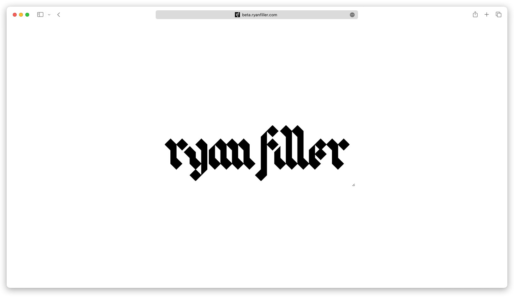 Follow along with my redesign at beta.ryanfiller.com (which may or may not currently match what is shown at the time of publishing this blog post.)