
Choosing a color palette for a website is hard. Its even more complicated when trying to choose colors that will work with both a dark-on-light and light-on-dark theme. I recently re-themed my site and here are some things I learned along the way.
Choosing a color palette
Picking a color palette is something I have always struggled with, even as far back as college. There are plenty of tools online that use algorithms to help you choose colors, Coolors and Adobe Kuler are two favorites of my favorites.
A trick I learned in design school is to find an image with a vibe you like and sample colors from it as a starting point. Color theory is complicated, and I think it’s okay to lean on experts who has already put in the work.
Good artists borrow, great artists steal.
Pablo Picasso
Ryan Filler
(Really I just wanted to make this joke, but the actual history of this quote was too ironic not to also share.)
Copyright law seems kind of fuzzy on if it’s legal to lift a color palette from an established brand. For instance, I wouldn’t recommend just copying, say, Google’s red, yellow, green, and blue. Photographs, advertisements, fine art, comics, even film and video game stills, though, are fair game. colorpalette.cinema is a great Instagram account that posts color pallets made from scenes of popular movies.
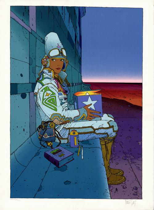
The color palette for my 2020 re-theme was built by selecting colors from Starwatcher II, an illustration by Jean “Moebius” Giraud.
Another pro-tip I learned in design college was to never use straight #000000 black or #ffffff white in a design. A design, even in print, will look much more intentional with a slightly desaturated black and a slightly temperature-shifted white instead of using the default colors. I try to keep this in mind when sampling colors from images and try to instead grab any dark color to stand in for “black” on my site. In fact, the color I chose for “black,” #080025, is actually a very deep purple and “white,” #fefdf2, is a very pale yellow.
Keeping accessibility in mind
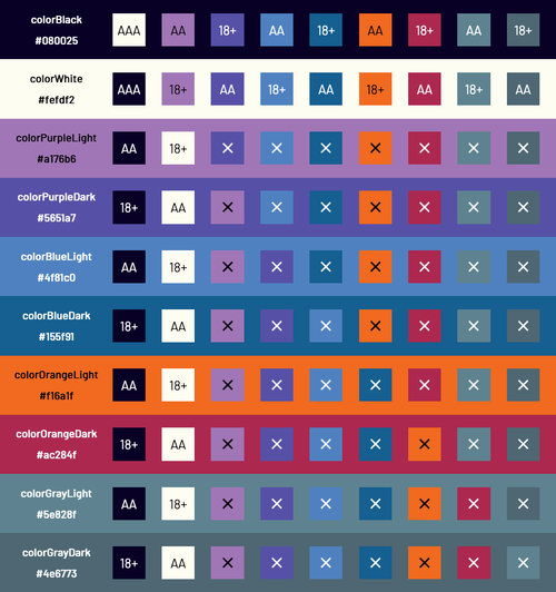
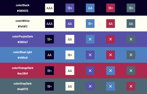
One of the hardest parts about choosing colors for the web is finding the right balance between what looks good and what is high contrast enough for all users. I’ve built a tool to help with this (learn how I built it in this post), but finding a combination that works can still be hard work.
Something that worked out well for me is to focus on making sure the first two rows and first two columns of this chart are all passing scores. In most scenarios, text will either appear as black or white on a colored background, or as a color on a black or white background. If there are other specific color combinations you know you want to use, make sure they also pass the WCAG color contrast ratio.
Firefox also has a cool feature in the accessibility section of their developer tools that will simulate how different colors look to users with different vision deficiencies.

Naming colors
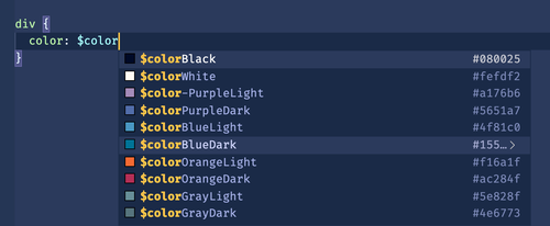
In modern web development, you’re probably storing these color values in some kind of variable. I was a user of SCSS variables for a long time, but I’ve switched over to using native CSS custom properties.
Naming these variables can be challenging because you want to pick a name that’s meaningful, unique, and searchable. I’m a fan of prefixing every variable with color- to help my text editor give me a tab completion list when I start typing the word color.
For more complex color palettes I like to name my colors with the Crayola naming convention so that each variant of, say “blue” has a unique name. These name variations can be tricky to choose out on your own, so I like to use this site to generate them. My friend Josh wrote an article that goes more in depth on this strategy.
My color list is pretty simple so I named each color with a dark and light variant and stored them as CSS variables on the :root element.
:root {
  --colorBlack: #080025;
  --colorWhite: #fefdf2;
  --colorPurpleLight: #a176b6;
  --colorPurpleDark: #5651a7;
  --colorBlueLight: #4f81c0;
  --colorBlueDark: #155f91;
  --colorOrangeLight: #f16a1f;
  --colorOrangeDark: #ac284f;
  --colorGrayLight: #5e828f;
  --colorGrayDark: #4e6773;
}
Narrowing down a theme
I think there are six minimum colors required for any website color palette —
- text - the main text color of the page
- background - the main background color of the page
- primary - a brand’s primary color
- highlight - a standout color, used to highlight buttons or other calls-to-action
- active - another standout color, using to indicate a hover state or focused element
- disabled - a muted color to show an element cannot be interacted with
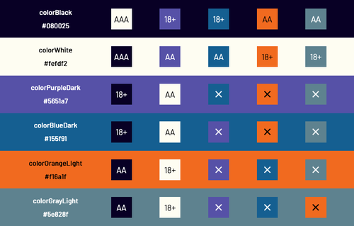
That’s not to say those are the only colors, but I personally think restraint is key to building consistent designs. Many design systems will use dark and light variations of each color for variety and increase the amount of accessible color combinations. I wanted my color palette to be sparse yet flexible and only have two versions of each color.
To set the theme colors I created a second set of variables. Each of these new variables describes how the color would be used and has one of the original named colors assigned to it.
:root {
  --colorText: var(--colorBlack);
  --colorBackground: var(--colorWhite);
  --colorPrimary: var(--colorPurpleDark);
  --colorHighlight: var(--colorBlueDark);
  --colorActive: var(--colorOrangeLight);
  --colorDisabled: var(--colorGrayLight);
}
Converting a palette to Dark Mode
I kept the same six utility colors from the default light mode theme, but reassigned new values for dark mode.
The closest color I have to an official “brand color” is #5651a7. This is the color I use for my page banners, and for the social media image that is generated for each post so for branding reasons I kept it as my primary color.
In addition to switching the text and background colors, I also picked brighter highlight and active colors that would stand out better on a dark background. I swapped disabled for the darker gray variant since light text would be appearing on it and I wanted to ensure it was still easy to read.
@media (prefers-color-scheme: dark) {
  :root {
    --colorText: var(--colorWhite);
    --colorBackground: var(--colorBlack);
    --colorPrimary: var(--colorPurpleDark);
    --colorHighlight: var(--colorOrangeDark);
    --colorActive: var(--colorBlueLight);
    --colorDisabled: var(--colorGrayDark);
  }
}
I’ll cover this much more in part three, but it’s worth noting that media queries don’t increase specificity. To make sure these variables are overwritten you’ll want to put the prefers-color-scheme: dark rules lower in the cascade.
Other considerations for Dark Mode
The five boxing wizards jump. quickly.
How vexingly quick daft zebras jump.
The first instinct to convert a theme to dark mode is to switch the foreground and background colors. This will get a design pretty far, but there’s more to consider than only these two colors. When I started my site over in 2020 with the default Gatsby theme it came with some nice default colors. Beyond black and white there was also brand purple and several gray variants. When switching to a dark-background theme, some of the darker gray text is unreadable, and vice-versa with light grays on a light background.
This awesome article by Adhuhamism on CSS-Tricks talks about other things to consider beyond just colors — like modifying the contrast ratio of images and making modifications to text weights and other subtle UI elements like borders and shadows.